How to Make Charts in Excel and Examples
excelcartstutorial.blogspot.com - The Charts command group is a collection of command buttons used for creating charts in Excel. This command provides 15 types of graphs that can be created to represent data visually. As the saying goes, "A Picture Speaks a Thousand Words", it is easier for us to convey the results of data analysis accompanied by graphs as support.
A. Types of Microsoft Excel Charts
The following are pictures of 15 types of charts that can be made with Microsoft Excel.
| Types of Charts in Microsoft Excel | ||||
|---|---|---|---|---|
| Column | Line | Pie | Bar | Area |
| Scatter | Stock | Surface | Radar | Treemap |
| Sunburst | Histogram | Box & Whisker | Waterfall | Combo |
B. Charts Command Group (Chart)
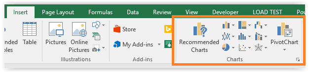
The Charts command button is on the Insert ribbon menu , here is an illustration
To create a chart, you can drag the range that will be used as a table. You can also format the range into an Excel table. So when creating the chart you don't have to drag it, just highlight one of the cells in the Excel table.
C. How to Make Charts in Excel
Column type graphs are one type of graph that is often used to represent data. Column charts in Excel are also called bar charts.
Here are some of the most suitable cases of using this chart,
- Sales graph based on the type of goods of a company in a month.
- Graph of the average height based on the gender of a kindergarten.
- Graph of the voting results of a general election.
Any chart created in Microsoft Excel can be converted to any other available chart type, for example a column chart (bar) can be converted to a line chart. This is tailored to the needs of the analysis and representation of the data required.
Example:
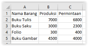
In the following example, a column graph is made from the production data of a paper company as follows,
Here are the steps on how to make a chart in Excel
Block range of data
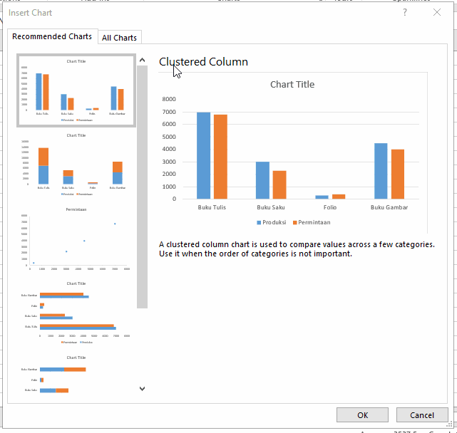
Click the Insert ribbon select Recommended Carts , so the Insert Cart window opens
Tip: Once you get used to it you can create charts using the command buttons located to the right of the Recommended Charts button .
Select the All Charts Tab , then click Column
Select the Column type to be used, then click OK
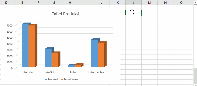
Shift the created chart
Add the name of the graphic by clicking on the word Cart Title
Perform Manual Chart Formatting
Formatting Charts is a process related to customizing the created charts. You can bring up the Format Selection by double-clicking the table area . So that the Format Charts panel will appear based on the design element selected in the table (for example, line chart elements, chart titles, etc.). Format Charts consists of 3 types of tab commands,
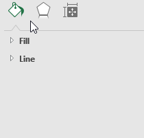
- Fill & Line: to customize the color and outline of the selected element
- Effects: to provide a visual effect on the selected element
- Size Properties: to change the size of the selected element
Perform Manual Formatting of Charts At this point you have succeeded in making a chart
D. Chart Designing and Formatting with the Ribbon Chart Tools
The Chart Tools Ribbon is the ribbon that appears when you highlight a chart. The following is an illustration based on the example above,
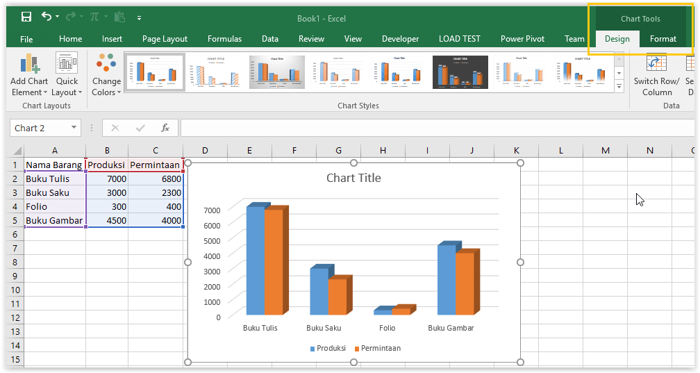
This Ribbon consists of 2 tabs, namely Design and Format ,
D1. Using the Design Tab
The design tab is a tab related to the customization of the graphic that is made. The Location of the Design tab is shown in the image above, next to the Format Tab. There are 5 groups of commands on the design tab.
Chart Layout: Adding Graphic Elements
The Chart Layout command group is used to add / remove elements on the chart, namely axes , axes titles , charts ( chart titles ), labels ( data labels ), data tables ( data tables ), error bars , line charts. ( gridlines ), legend / caption ( legend ), lines , trendlines , up / down bars . There are 2 commands, namely Add Chart Element (add manual elements) and Quick Layout (quickly add elements with a template that is already available).
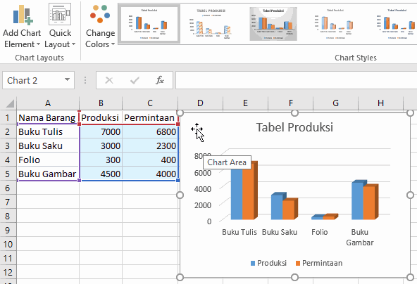
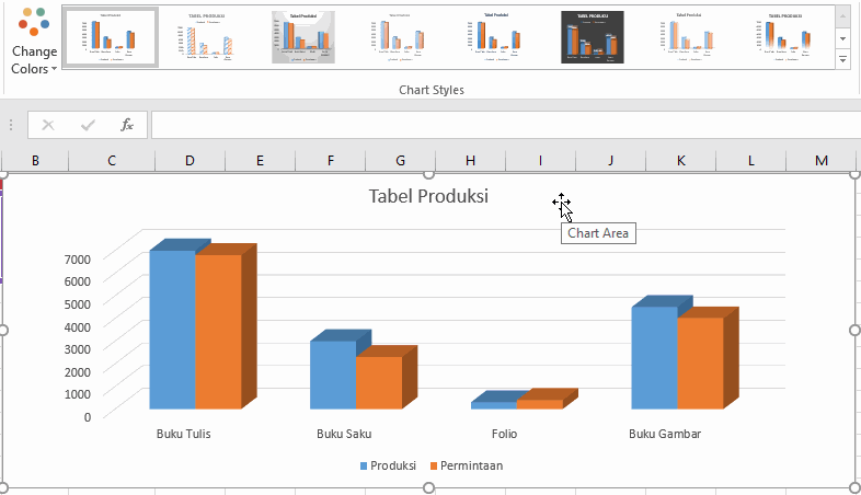
Chart Style: Change the Chart Style
The Chart Style command group is used to select styles on the chart. You can change the style as well as the style color (Change Colors) on the chart using this group of commands.
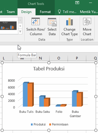
Data: Select Graph Data
The data command group is a group of commands used to select data to be displayed on the chart. This command group consists of 2 command buttons, namely Switch Row / Column and Select Data .
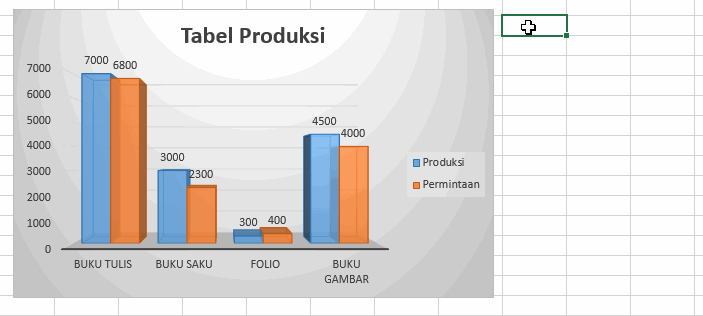
The Row / Column switch is a command button that is used to change the chart grouping by column or row. For example, grouping data based on rows consists of notebooks, pocket books, folios, and drawing books. With each group having 2 data points, namely production and demand. Vice versa which can be illustrated in the following figure,
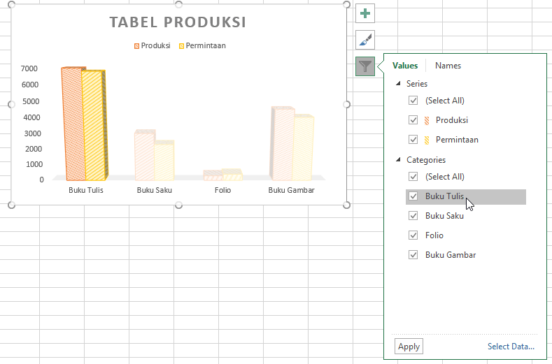
Select Data is a command button to select table rows and columns that will be used as data on the created chart.
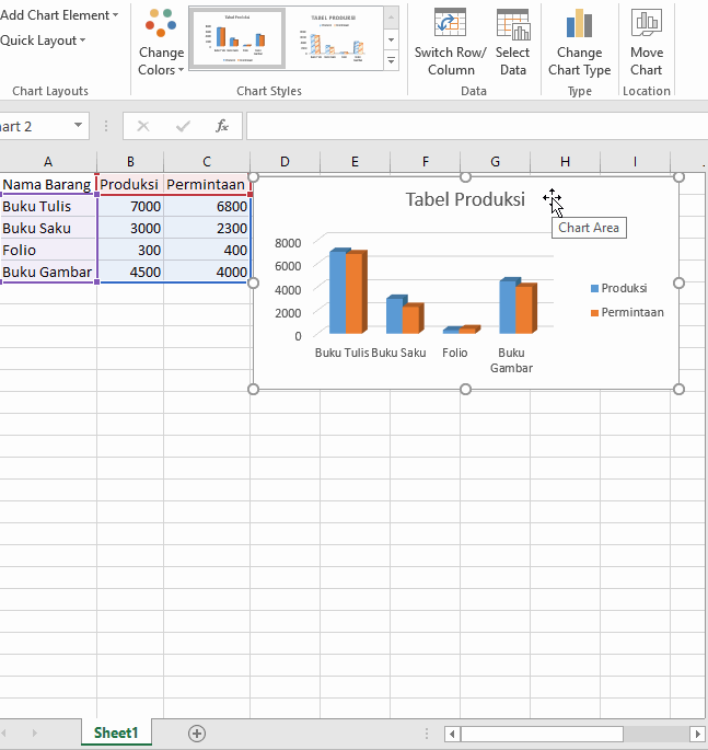
An example of removing the "Request" data points on the chart You can increase or decrease the data displayed on the graph by checking or unchecking the Select Data Source window as illustrated above.
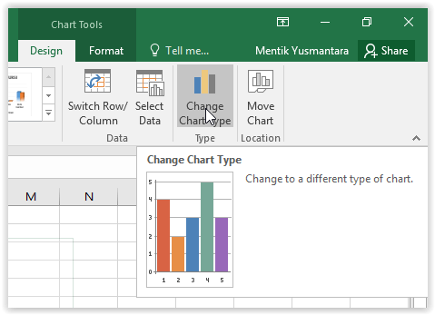
Type / Change Cart Type: Selects a Chart Type
This command button is used to change the type of chart that is highlighted. When this command is clicked, the Change Cart Type window will open (as in section B of this article)
Location / Move Cart: Move Chart
This command is used to move the highlighted sheet to another sheet or a new sheet. Here's the illustration,
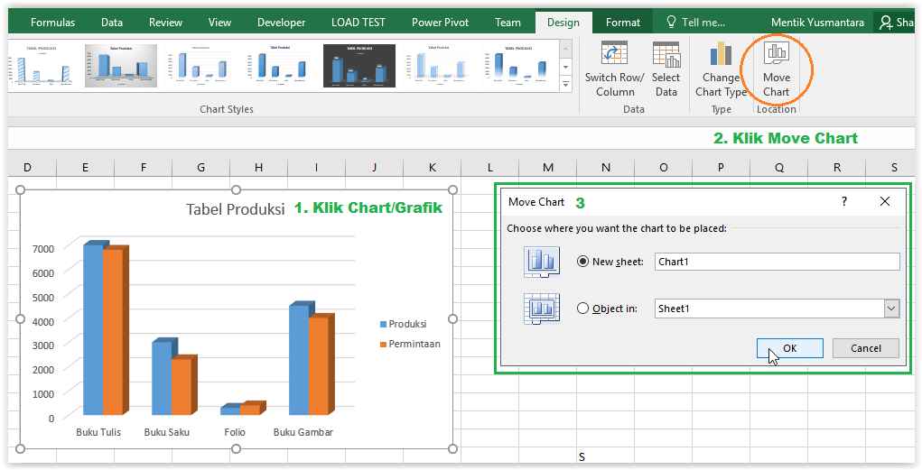
In the Move Chart window, you can select the column New sheet (move to a new special sheet) and Object in (move to an existing sheet). bandarq online
D2. Using the Format Tab
Tab format is a tab that contains a set of commands related to formatting charts that have been made. In Part B , we learned how to manually format using Format Selection . Using the Format tab is a more complex way of formatting graphics.
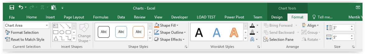
There are 6 groups of commands as follows,
- Current Selection : formats the chart based on the highlighted elements via the Format Selection Pane.
- Insert Shape : to add a shape object to the created graphic.
- Shape Style : to change the style of the highlighted shape.
- WordArt Style : to add a WordArt effect to the text in graphics .
- Arrange : to adjust the position of objects and graphics.
- Size : to change the size of the highlighted graphic.
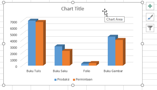
E. Quick Access Feature on Charts
In Microsoft Excel 2013 and 2016 there are 3 additional Quick Access features on the chart as follows,
Chart Elements: Shortcuts to Adding Graphic Elements
Cart Styles: Shortcut Chart Style
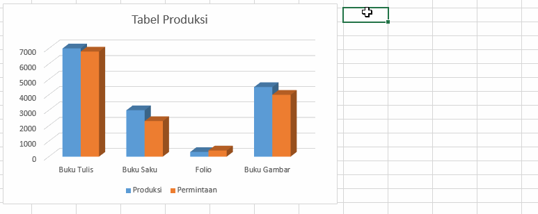
Chart Filters: Shortcuts to Selecting Data


Komentar
Posting Komentar