7 Line Charts and How to Make a Line Graph in Excel
excelcartstutorial.blogspot.com - A line graph or line is a graph that uses points as data points and is then connected to the next point. This graph is one of the most used graphs after bar charts. Creating a line chart in Excel is not much different from how to make a bar chart . In general, line graphs are used to compare data based on a certain time series; for example: website traffic per minute, number of tourists per day, number of babies born each month, and so on.
A. Types of Line or Line Charts in Excel
Here are 7 types of line chart templates in Microsoft Excel that you can choose from quickly.
| 7 Types of Excel Line Chart Templates | |
|---|---|
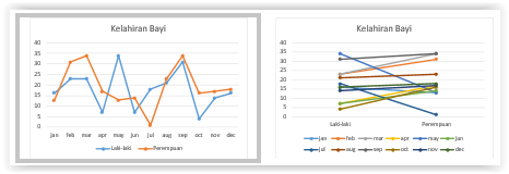
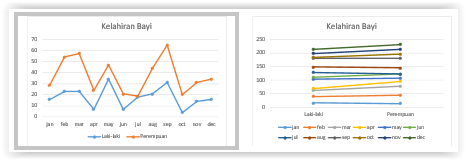
| 1) Standard Line | 2) Stacked |
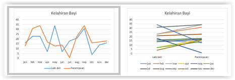 | 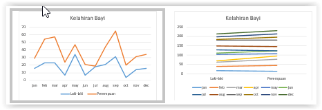 |
| 3) 100% Stacked | 4) Line with Markers |
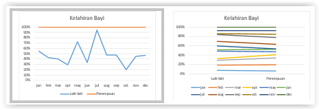 |  |
| 5) 100% Stacked + Markers | 6) Stacked + Markers |
|  |
| 7) 3-D Line | |
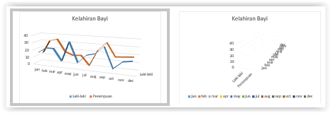 | |
B. How to Make a Line Chart in Excel
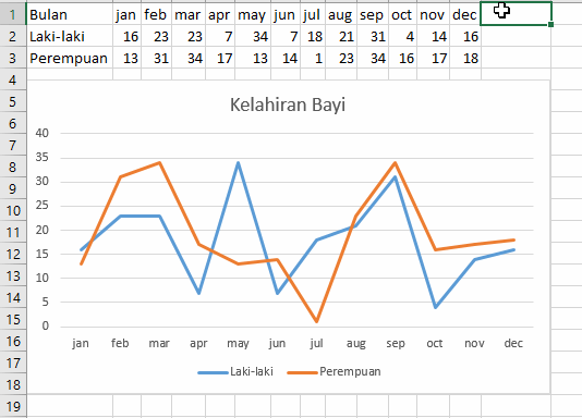
For example, a line graph will be drawn from the birth data of babies in a hospital based on sex for 1 year as follows,
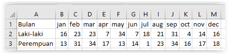
Block range of data
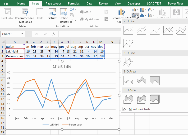
Click the Insert Line and Area Chart command button on the Insert ribbon
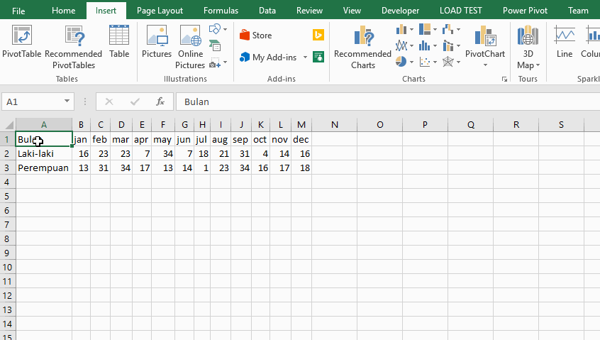
Select the required line chart type, in general there are 2-D Line and 3-D Line charts as shown in the following illustration
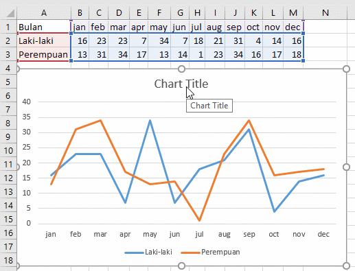
Create a chart name by clicking "Chart Title"
Select data using the Select Data feature: Right click the graph and select Select Data
The Select Data feature is used to select the data entered in the graph that is created. Here are some commands you need to know in the Select Data Source window in the illustration above, bandarq online
- Row / Column Switch: to swap the position of column and row data in the table in the created chart.
- Check data: to select specific data that is displayed on the graph that is created.
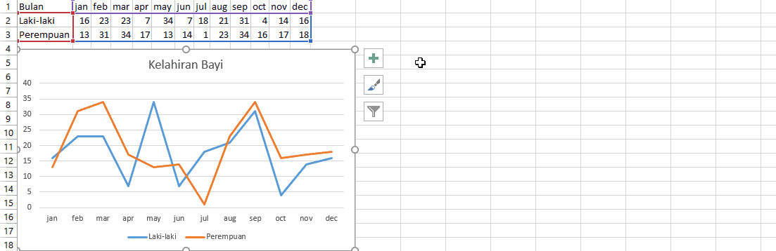
Set the chart layout
Of course, we need to adjust the layout regarding the size and position of the graphic so that the document to be printed or presentation looks tidier. Here's the illustration,
Related tutorial: Doing Graphic Designing and Formatting (Parts C and D)
You can change the color, style / theme, add elements, visualize elements by designing and formatting line charts.


Komentar
Posting Komentar