2 Types of Histograms and How to Make a Histogram in Excel
excelcartstutorial.blogspot.com - The histogram in Excel is a chart feature for displaying a column or bar graph visualization that displays the frequency of data with a certain distribution. Unlike Microsoft Excel 2007, 2010, and 2013. In Microsoft Excel 2016 you can make histograms in Excel more easily in determining bin numbers. There are 2 types of histograms that can be created with Microsoft Excel.
| Type | Description |
| Histogram | Displays the distribution of data based on bin numbers. |
| Pareto | Displays the distribution of data and displays a line that represents the rate of change in the distribution of data between distributions. |
A. Creating a Histogram in Excel
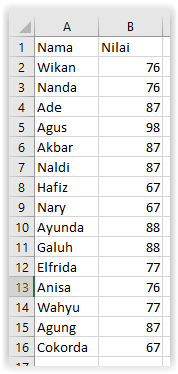
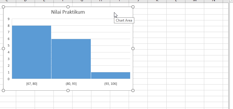
Suppose a histogram is made of the Microsoft Word practicum exam scores from 10 students as follows,
Here are the steps for making a histogram in Excel,
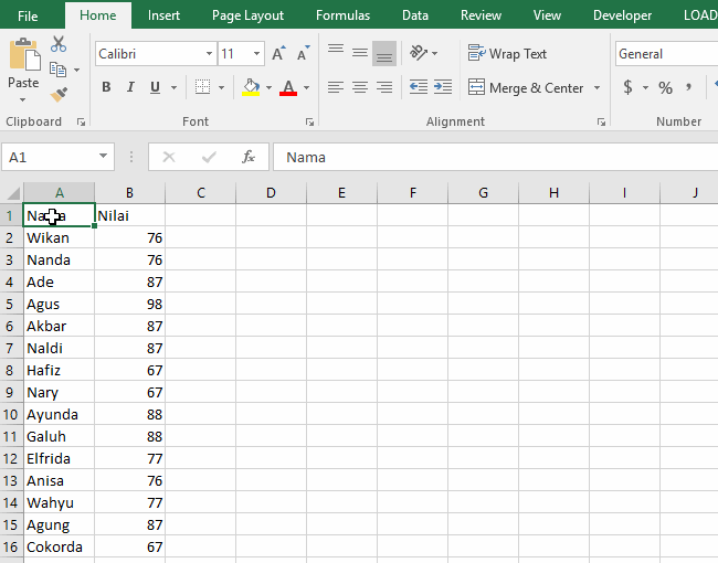
Block range of data
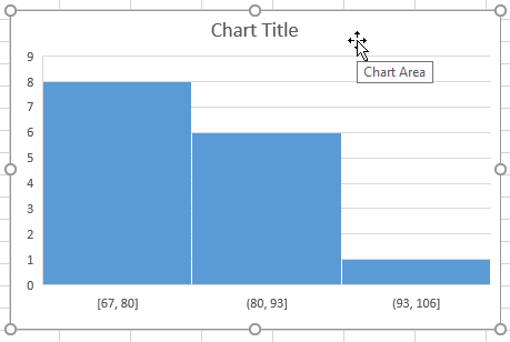
Click the Insert Statistics Chart command button on the Insert ribbon
Choosing the type of chart to be used, you can choose Histogram or Pareto
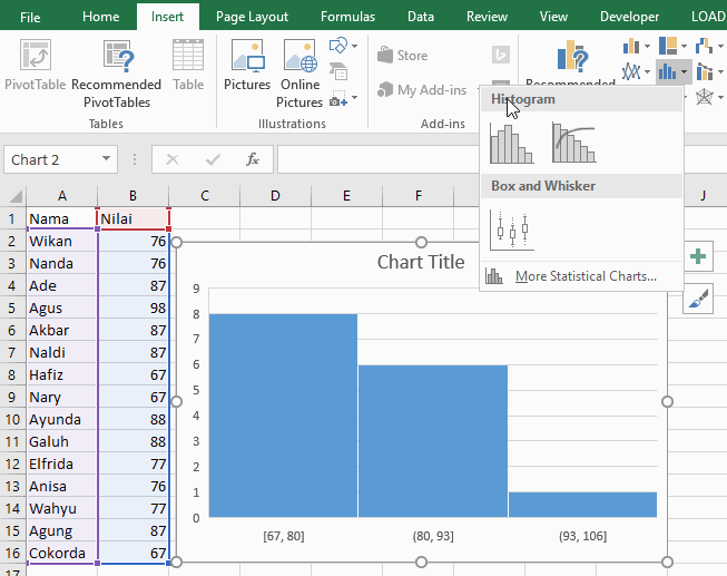
Give the histogram a name
To give a name click "Chart Title" as shown in the following illustration,
B. Axis Format: Determine the Distribution of the Histogram Data
Unlike Microsoft Excel 2007, 2010, and 2013. In Excel 2016 bin number determination can be done through Format Selection , by selecting the horizontal axis of the histogram. Here are the steps to determine the histogram bin numbers in Excel, bandarq online
Double-click the horizontal category axis on the previously created histogram . Then select Axis Options
Configure the data distribution by changing the options in the Bin section
By default Microsoft Excel uses automatic bin configuration ( Automatic )
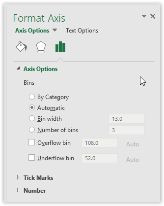
There are 4 bin options, namely (click 2x to see the changes):
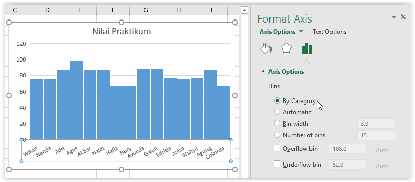
By Category , to display the distribution of data by category, in the example Microsoft Excel will use the name of the value owner as the category.
Automatic , is the initial configuration of the histogram that is created.
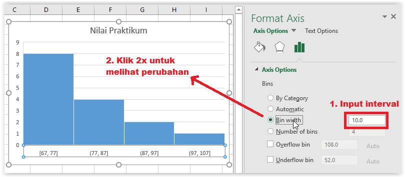
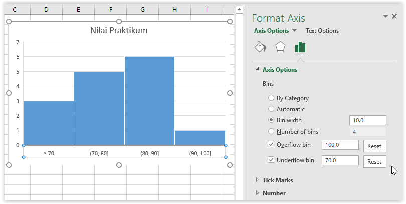
Bin width , is a bin configuration by determining the interval for the distribution of data generated by the histogram. For example, a histogram with a data interval of 10 will be created, it can be illustrated as follows,
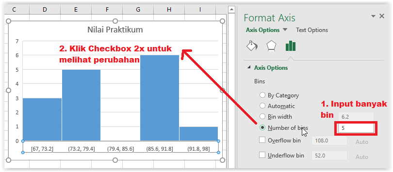
Number of bins is a bin configuration by determining the amount of distribution of data generated by the Excel histogram. For example, a histogram with 5 data distributions will be made, it can be illustrated as follows,
Specify the Overflow bin and Underflow bin (optional)
You can configure this section if needed. The overflow bin is used to determine the maximum point of the histogram horizontal axis. The underflow bin is used to determine the minimum point of the histogram horizontal axis.
For example, a histogram will be created using a data distribution interval of 10 with a horizontal axis of 70-100 from the data above. It can be illustrated as follows,


Komentar
Posting Komentar