How to Make an Excel Pie Cart or Pie Cart Chart
excelcartstutorial.blogspot.com - Pie chart or pie chart is a form of data visualization in a circle divided into slices that represent the numerical value of a data. Pie charts are often used to represent data with a single numeric variable. Here's how to make an Excel pie chart.
There are 5 types of pie charts in Microsoft Excel
| Pie Chart Types | |
|---|---|
| Pie | 3-D Pie |
 |  |
| Pie of Pie | Bar of Pie |
 |  |
| Doughnout | |
 | |
A. How to Make a Pie Chart in Excel (Pie)
To make a pie chart the method is not much different from making a bar chart in the previous tutorial. The following is an example of a pie chart application made with Microsoft Excel,
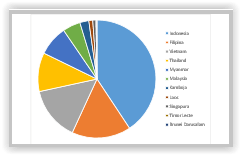
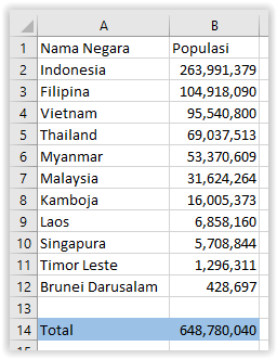
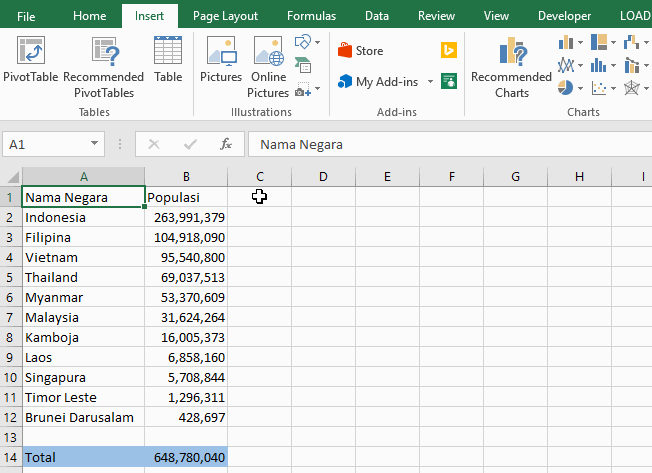
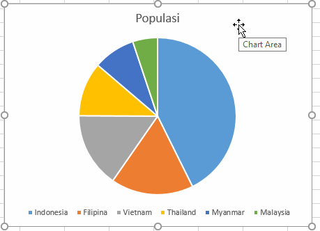
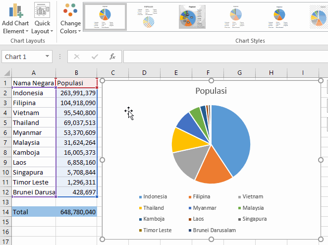
Example: Making a Pie Chart for the Population of Southeast Asia
A pie chart will be made from the population data of the population of Southeast Asia in 2017 based on the statistical calculations of the United Nations Population Division as follows,
Here are the steps for making an Excel pie chart,
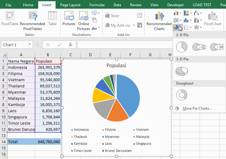
Highlight the data range
Click the Insert Pie and Donut Chart command button on the Insert ribbon
Choose the type of pie chart needed, you can choose 2-D Pie, 3-D Pie, or Doughnout
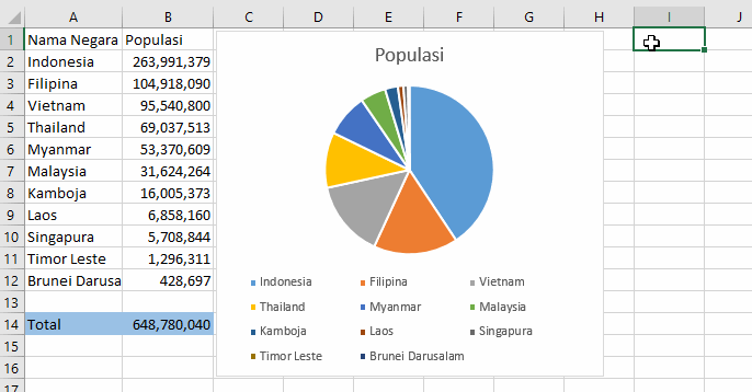
Lay out the pie chart
You can adjust the layout by panning the pie chart and resizing the pie chart by dragging the points on the outside of the pie chart.
Select data using the Select Data feature: Right click the pie chart and select Select Data
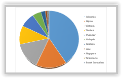
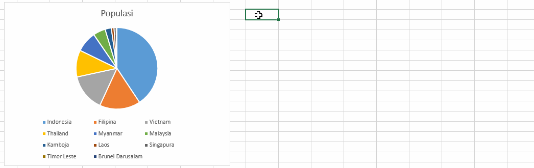
For example, we will create a pie chart of 6 countries in Southeast Asia with the most population, you can uncheck the 5 countries with the least population. It can be illustrated as follows, bandarq online
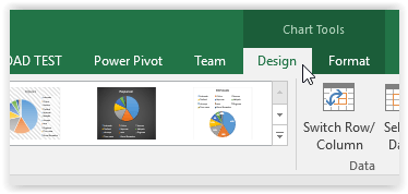
Change the title of the pie chart: Double-click the title
How to Change the Name of an Excel Pie Chart Congratulations the pie chart has been successfully created.
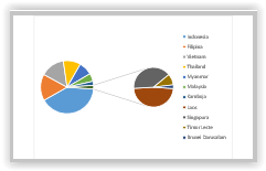
B. How to make a pie chart with percent, value and data title in Excel
To make it easier to see the intensity of a data from the whole data it becomes easier, usually degrees or percent are used. To do this, the Quick Layout command button can be used . Here are the steps,
Click the pie chart
Click the Design ribbon
Click Quick Layout, then select the required layout type
Example of making a percent on a chart in Excel


Komentar
Posting Komentar